Small Home Gazette, Fall 2011
Letter From the Editor: applied ornamentation
One of the basic tenets of the Arts & Crafts movement is that natural materials and exposed construction methods are beautiful in and of themselves, without the need for applied ornament. The movement arose during the latter half of the 19th century in opposition to Victorian industrialization, when shoddy, mass-produced goods decked out with flashy surfaces proliferated.
Does any of this sound familiar? It seems we’re still surrounded by insincerity. And nowhere is this more apparent than in many new buildings. What’s most aggravating is that the knock-offs of real, honest building materials have become completely disassociated from their origins, leading to truly absurd results.

Caution: Watch for Falling Rocks. (No wonder they moved.)
First example: stones. Years ago, artificial veneer stone became widely available. It’s affordable, lightweight and frankly, some of it looks reasonably like genuine stone. I have no deep-seated objection to artificial stone—the best of it is a viable alternative to those who want a stone foundation but can’t afford real stones and the skilled labor to install them correctly. The problem came when fake stone migrated to places nature never intended; places where the laws of physics apparently don’t apply.

Absurdly tall and thin “stone” columns in front of a bank in Baxter, Minn.
Equally ridiculous is the use of fake stones above a garage door opening or plate-glass windows, with nothing to keep them (if they were real) from falling into the void but a thin strip of trim. Another goofy example I saw recently was stones on posts holding up a bank’s sign. The two posts, scarcely more than a foot in diameter, towered 20 feet into the air. Had the stones been real, the sheer weight of the structure would have brought the entire sign crashing down with the first breeze.
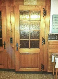
These hinges are decorative, but also functional—they are scaled to support the heavy door. This door is in a restaurant in Leysin, Switzerland.
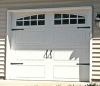
Nice looking garage door, but would those slender hinges support doors of that size? And what happened to the other half of each hinge?
Final example: window shutters. Shutters once served a purpose—they could be fastened across a home’s windows to keep inclement weather and intruders out. In fact, they’re still widely used in some countries. But the shutters you see on most newer homes are clearly counterfeit. They’re too narrow and too short (or too wide or too tall) for the windows they flank, and are often mounted a couple of inches away from the window’s trim boards. A mere glance tells you that if they could swing over the window, they wouldn’t come close to fitting. Why would a homeowner add something that makes their home look cheap and tacky?
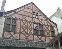
Real half-timbering on a centuries-old building in Dijon, France. Charming and functional.
Take my bungalow, for example. On my front porch gable is a louvered vent. It’s charming. And it’s phony. It doesn’t vent my attic at all; it’s just an ornament. And picture those adorable Tudor bungalows and larger Tudor style homes built during the early 20th century. Those half-timbers supporting the gables? Bogus. They’re just boards applied to the surface, whereas the exposed timbers used during the actual Tudor period were structural and therefore beautiful, according to Arts & Crafts philosophy.
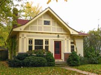
Fake half-timbering on a bungalow in St. Paul. Not functional, but still charming.
Our bungalows, though descended from the original British Arts & Crafts movement, are not pure. When they jumped the Atlantic they became popularized, democratized and mass-produced. Arts & Crafts ideals collided with imperfectly remembered history and our love of Hollywood fantasy. The result of this mash-up is the American bungalow.
So, how do I reconcile my admiration of bungalows and my disdain of the more absurd elements of modern construction? I rationalize, justify and compartmentalize, of course.
Seriously, I do see a difference. When bungalow builders used artifice, it was more closely related to the real thing. That louvered vent in my gable could easily be functional. Half a ton of stones supported by a piece of plate glass is not. The fake half timbers on Tudor bungalows are of the right dimension and in the right location for functional supports. Puny strap hinges and shutters look stupid. And the swayback roof line… Well, it’s just so damned charming that I don’t care.
See how easy that is?


