Small Home Gazette, Fall 2020
Editor Letter: design trends that challenge
During a year when it seems like every day is a bad news day, we can at least take comfort in the refuge of our cozy homes. But while you’ve been spending so much time there, do you experience a little interior design envy? I’ll be honest—sometimes I can be tempted by something fresh and sparkly.
I haven’t subjected myself to any HGTV makeover shows recently, or even an episode of PBS’ This Old House. All these shows include old houses, but none of the shows are about old houses. They’re about grafting new products and floor plans onto old houses.
But look a little further, and you’ll find some tastemakers who are bucking current trends. Below are examples I’ve collected, if for no other reason than to reassure myself that my bungalow is not completely irrelevant.
First, do you think your dark wood furniture is passé? Don’t unload it just yet. Take a look at this Star Tribune article: “Hate old ‘brown furniture’? Young Twin Cities designer proves it can look fresh”. Tasha Shultz explains that she first looked to vintage wood furniture because she had limited funds and because she didn’t want a typical look. “These older pieces are usually really well made, and I like that they’ve got quirks,” she says.
Then there are the “grandmillennials,” a movement in which 30-somethings embrace the floral patterns, natural wicker, chinoiserie and saturated colors of their grandmothers’ era, albeit with a lighter touch.
But, you say, mid-century modern is here to stay! Perhaps, but there are already some young people ready to move on. On the website Jezebel, Megan Reynolds pleads, “Please Let 2020 Be the Year Mid-Century Modern Design Finally Dies.”

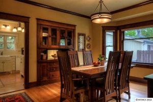
The classic room layout in this 1915 bungalow shields any food preparation from guests in the dining room.
Then there’s the sacrosanct open plan. Finally, its adherents insist, human-kind has awakened to the realization that God intends the kitchen, living room, dining room and front entry to be combined into one big reflection of what your mansion in heaven will look like. Right? Well…take a look at the articles found in publications like The Boston Globe, House Beautiful, Real Simple and more:
- “People in open-concept homes are realizing the walls were there for a reason”
- “Can We Just Stop With Open Floor Plans?”
- “Please Stop With the Open Floor Plans”
- “Why I’m Totally Over Open Concept House Plans”
- “15 Reasons to Think Twice About Open Floor Plans”
- “11 Reasons Against An Open Kitchen Floor Plan”
Why are these heretics risking eternal damnation (and worse, negative feedback in the comments section)? Read the articles for details, but recurring themes are: noise, odors, lack of privacy, visual clutter, and a dearth of places to position furniture and hang artwork.
I’ll finish by pointing to a recent Star Tribune article titled “Sold! Twin Cities home buyers spur run on Duluth homes”. The gist is that with the prevalence of people working at home because of the pandemic, Duluth is suddenly looking mighty good. Part of the reason is proximity to the great outdoors.
But it’s also about the houses:
“Buyers looking for that perfect work-from-home setup will find a lot to love in Duluth’s aging housing stock, much of which was built before open spaces became the norm. ‘I’ve been doing this for 25 years and until now everyone wanted open, open, open,’ said Realtor Susan Dusek. ‘Now it’s too noisy; we need more defined space for Zoom calls—Duluth is full of old houses that are more compartmentalized.’”


