Small Home Gazette, Spring 2021
Arts & Crafts Wallpaper
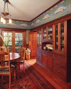
In an Arts & Crafts home with an abundance of woodwork, a bold scenic frieze acts as a transition from wall to ceiling. Photo: Doug Keister.
The term “Arts & Crafts wallpaper” covers a range of wallcoverings designed between 1860 and 1910, which originated in several countries—papers that were ultimately produced in various calibers of design and production methods.
Consequently, the moniker is as all-encompassing as the phrase “classical architecture.” You cannot pinpoint Arts & Crafts to a specific moment in time as you might French Art Nouveau or 1970s silver mylar—it is a topic that reaches far beyond the usual decade or so typically allotted to a specific style.
In the Beginning
The father of the Arts & Crafts movement, which began in England in 1860, is considered to be William Morris, whose designs for wallpaper, fabric, and carpeting revolutionized interior design and remain iconic more than a century after his death.
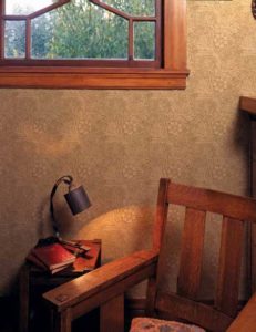
William Morris, the patriarch of the English Arts & Crafts movement, was responsible for many of the enduring patterns that bear his name. Here, his “Marigold” Arts & Crafts wallpaper, printed in organic colors more befitting an American interior circa 1900, embellishes a room filled with Craftsman-style furnishings. Wallpaper: Bradbury & Bradbury Wallpapers.
Morris and his contemporary, Charles Locke Eastlake, who published the ubiquitous design tome Hints on Household Taste, sought to reverse the encroaching industrialism they found dehumanizing, and return design of the built environment to a more naturalistic concept.
Stylistically, Arts & Crafts was a revival of medievalism, and its ornamentation, while appearing fancy to those of us living in the present day, was considered simplified compared to the sinewy overlapping curves and deep carvings of the era’s immensely popular Rococo Revival. Arts & Crafts arose in defiance to this curvilinear style, which was regarded as French in nature—almost as though the perpetual rivalry between England and France had shifted from the battlefield to the drawing room.
Arts & Crafts proponents stressed an honesty of construction and material, meaning that items resembled what they were meant to represent, and assembly methods were evident. For example, a table would be constructed so that the timbers and joints were obvious and not concealed under an excess of applied carvings shaped like roses, grapes, or animals.
In the case of Arts & Crafts wallpaper, this meant that patterns never misrepresented themselves as low- or high-relief architectural ornament, a concept that flew in the face of French Rococo wallpaper, which typically had large floral sprays and scenes of exotic lands adorned with ruined columns and architraves that were intended to appear as if three dimensional. These papers appeared in bold palettes, too: colors that were bright and jewel-toned in clear, primary hues.
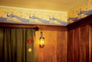
Favorite motifs of Arts & Crafts wallpaper designers, especially the British, were animals in highly stylized renderings. Wallpaper: Peacock Briar Frieze, Bradbury & Bradbury Wallpapers.
By contrast, Morris’ patterns bore undulating leaves and sprays of flowers, each set deftly to repeat. Together with his colleagues, Morris stylized the botanical motifs and flattened them out; they would never be mistaken for the more sculptural papers that preceded them—the Arts & Crafts design elements showed no trace of relief or artifice. Their palettes were a radical departure as well. The designers softened them by selecting tertiary colors, so that green became olive, red became terracotta, yellow became ochre, and so on. While the occasional blue shows up, at least in English Arts & Crafts, it is far outweighed by the use of greens.
Technological Breakthroughs
In his pursuit of handcrafted materials, Morris used block printing to produce his wallpapers. In block printing, each color of a design requires that a separate slab of wood be painstakingly carved. For example, there would be one block for the leaves and another for the shading inside the leaves; one for a flower petal; and another for the petal’s edges, resulting in easily a dozen or more blocks per pattern. Each block also required careful calibration to align with the others, a process known as registration. As the ink was transferred from the block onto the paper (think of the potato prints you made as a kid in art class), the resultant print offered a rich, textured appearance. Block printing was (and remains) time-consuming both in preparation and production, and therefore, expensive.
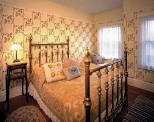
Designers were mindful of the vertical and horizontal repeats of their patterns, and would often lay out floral patterns in trellised arrangements to create a cozy environment.
But the 19th century was a time of fantastic technological progress. Cast iron foundries allowed members of the middle class to possess intricate metalwork that previously could only be forged by hand; duplicating lathes could create dozens of identical turnings at a time; and wallpaper soon could be churned out by roller printing, which permitted unlimited numbers of different patterns to be produced quickly and in vast quantities. This also allowed designers and manufacturers to change styles at will to suit fashion. Morris himself preferred the integrity of block-printed papers, although eventually, even he machine-printed some patterns as an economic concession.
Mass production reduced the cost of wallpaper to the point where it competed with paint. And unlike paint, which required a wait of several months for plaster to cure, wallpaper could be hung over a freshly plastered wall. Compared to block printing, there was also more consistency to the registration and an evenness to the print, which, depending on one’s point of view, was either desirable or lacked the charm of a handcrafted product. In an ironic twist, Arts & Crafts designs were completely overtaken by the very principles the movement rebelled against—cheap, market-driven goods.
When William Morris died in 1896, a new generation of British designers continued in the Arts & Crafts tradition. Most notable was C.F.A. Voysey, an architect and designer who created a large archive of animal and foliate patterns for fabrics and wallpapers. His designs are playful and often based on fairytales—with cats, birds, and rabbits scampering about—and they are also more stylized and less detailed than Morris’ work, bridging the eras between Victorian and Modernism.
Craftsman Connection
If you are wondering what William Morris has to do with your own bungalow, America’s Mission or Craftsman style drew much of its inspiration from the English Arts & Crafts movement’s reduction of ornament and the “flattening out” of elements.
Led by Gustav Stickley, who was famous for his simple, straightforward furniture designs, this approach translated to wallpaper with patterns evolved from naturalistic elements that incorporated geometrics and stripes in their vocabulary. The palettes of these wallcoverings were even more organic and simplified than those of their earlier English cousins; brown, greens, and golds were pervasive, with simple flashes of brighter accent colors on occasion.
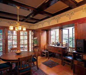
American Arts & Crafts wallpapers often reflected the growing popularity of the emerging Midwestern Prairie School of architecture and the Japanese influences of the West Coast. Photo: Doug Keister. Wallpaper: Oakleaf Frieze, Bradbury & Bradbury Wallpapers.
While the first generation of English Arts & Crafts was more “Victorian” in feel, the second generation, concurrent to the American Craftsman style, could be more Art Nouveau in appearance. The same applied to American Arts & Crafts wallpapers, but these also revealed the robust influences of the Prairie School and the works of Frank Lloyd Wright and Louis Sullivan. At this time, Americans were beginning to develop their own design vocabulary that drew from Native American and Western motifs.
One of the features that became popular in the late 19th century was the use of an embellishing element called a frieze or border. These could range from simple, 3-inch-wide strips to massive bands that were architectural in appearance and exceeded 2 feet in height. They were usually placed at the upper extreme of a wall but also could be used to frame a section of wall fill, or around door and window casing.
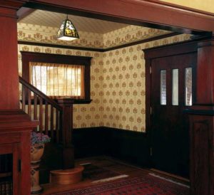
The 1910s witnessed the waning of ceiling papers, but American Arts & Crafts papers were, and are, offered in complete room sets of fill, frieze, and ceiling paper. Wallpapers: Burnaby wall fill, frieze and ceiling fill, Bradbury & Bradbury Wallpapers.
Popular motifs for friezes were forest scenes, seaside vistas, and repeating patterns of flowers or leaves that were highly stylized and linked with geometric ornament. In addition to adding visual interest to a room, the use of borders also helped anchor the wall to the ceiling and was compatible with the thick, dark oak timbering found in new Craftsman-style homes.
It is important to note that while the Craftsman style was indeed on the cusp of 20th century Modernism, it continued to have one foot firmly planted in the 19th century. And nowhere did the love of ornament survive more than on the walls of bungalows and Mission-style homes.
Article reprinted with permission of Old House Journal.


