Small Home Gazette, Summer 2008
A Bungalow Owner’s Dilemma: Finding Space Without Losing Soul
Our little bungalow often reminds me of a miniaturized version of some grand estate, with small versions of expansive back porches, sun porches and breakfast nooks. Big dreams in economy scale. With such reflections, I am reminded of the values inherent in bungalow living. Even if we wanted to acquire the excess that defines our generation, this house pushes back, saying, always politely, “I simply haven’t the room.” But then the neighbors come around or my nephews visit, and I find myself aching for space we don’t have.
Therein lies the bungalow owner’s dilemma: how to find the space modern living demands while preserving the soul of an old home. Bungalows are so welcoming because the spaces within them are so well-defined; a characteristic too often lost in modern remodels. Whether the house was designed by Greene and Greene, Wright, Stickley, or Sears, Arts & Crafts homes have three essential ingredients: proportion, details and woodwork. Room sizes are proportional to ceiling heights and transitions between spaces are marked with details such as millwork archways, stained glass windows and doors. Remove those details and the space has a sudden identity crisis. Replace them and the room is alive again. In fact, bringing natural woodwork into a room is one of the easiest ways to bring character back to an old house.
Easy, but not cheap, which is why such details tend to drop out of contemporary designs for large spaces. In her book The Not So Big House, Sarah Susanka notes that too many homebuilders today trade these details to satisfy our thirst for floor space. She observes that in the competition for bragging rights on square-footage, we trade the character—the soul—of our homes.
Space Versus Detail
Fortunately, space versus detail does not have to be an either/or proposition; with careful and creative planning, we can have both. Too often, homeowners pay for a 1,000- square-foot expansion to solve what might be a 100-square-foot problem. But when the project is done, the family finds that a significant portion of the new floor space remains untrod. By taking a more precise approach to renovations, we can direct the money saved on floor space to adding details to the design.

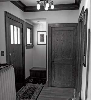
A clumsy front closet with sliding doors (not original to the house) was replaced with this coat closet and bench niche. New woodwork was carefully matched to the old.
The first challenge is identifying precisely the frustrations we want to solve, and then remembering that each solution does not require an entirely separate room. Is the frustration the lack of a kitchen table? Kids and guests underfoot in the kitchen? Lack of sunlight? No place for a quiet desk? No guest room?
A guest room that’s used a few times a year can double as an office you use more often. A breakfast nook addition that keeps your kids corralled during the afternoon can be your after-dinner sanctuary when the kids bolt toward the television. For that solution, you don’t need a whole other room; you need comfortable bench cushions, a great glass of wine, and spectacular lighting on a dimmer to transform the feeling of the space. Similarly, you might solve your craving for a den—and a guest bed—with a broad window seat encased by bookshelves. This can be accomplished with a 4-foot bump-out, not a 15-foot expansion.
Kitchen renovations can be the worst offenders in dramatically altering a home’s original sense of proportion. Many of us have experienced the jarring feeling of passing through a gorgeous old dining room into a massive kitchen/family room expansion, sparkling with granite. Crossing the threshold leaves us feeling as if we’ve stepped through time—a jolt to the subconscious that lingers, unsettling even in the most dazzling new space. The good news is that because bungalow kitchens were so disproportionately small, their footprint can often be doubled without offending the proportions inherent in the house’s design. But here too, the trade off in details for floor space is worth careful consideration.
Old solutions to new problems can sometimes help us achieve kitchens that suit modern living while preserving the character of an old home. Rather than adding a suburban style kitchen/family room, bungalow owners might first consider solutions using alcoves, sunrooms, window seats, pantries or breakfast nooks. These solutions keep sight lines open but take up less square footage than conventional “open” kitchens. And because they are essentially multiple smaller spaces rather than one big one, they call for details to mark transitions between the spaces and respect the proportions typical of older homes.
Working With Our Home
When we finally tackled our small kitchen, I started sketching floor plans, trying without success to turn the back end of the house into something with more open space that included a breakfast bar I had enjoyed in a previous, more modern, home. Gratefully, my old house pushed back—again—with beams that wouldn’t budge (at least, not affordably).
Happily, the solution our old house offered beautifully extended the character of our home. We converted an old “cold-room” (pantry) into an open sidebar/pantry that, with the addition of a millwork archway, is now the transition to a four-season sun porch just large enough for a table. This porch, formerly an unheated back entry, is now the room in which we spend most of our time.

Left photo is of the kitchen and back door, before renovation. The pantry is through the opening to the left of the door. To the right is the same area after renovation. The larger opening also allows access to the pantry area.
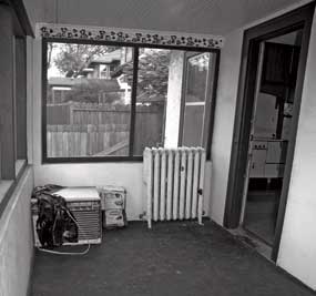
 The back porch, prior to renovation. |
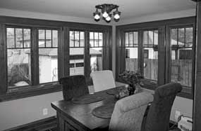
 The back porch, after renovation. The room’s footprint is the same as before. |
We found space for many of the kitchen gadgets that live on modern countertops in a long, pull-out drawer built into the “dead” space next to the refrigerator. And we added to the charm by blending old and new millwork, saving money and making visitors wonder where our new space begins. In all, we added a mere 80 square feet that includes 2 feet of additional counter space, but with it transformed the functionality of the room so much it feels like we added a whole new kitchen.
During the project, I often focused on the high cost-per-square-footage ratio, and doubted whether the expense would be worth the result. Now when I settle into that sunny room, I have no doubts that the project was worth its price. A recent appraisal was equally reassuring—our investment dramatically improved the home’s value without a dramatic increase in square footage.
Living in an old home is in many ways an ongoing negotiation with time and space Whether I am thumbing through gardening magazines or kitchen wares catalogues, our house regularly checks my appetite for “stuff”—one of the many reasons I love living here so much. When I feel most soothed by this house, I realize that my eyes have locked on some exquisite detail imagined by a craftsman almost a century ago. In those moments, this old house reminds me that in a well-designed space, less truly is more. And when I crave more space, the house negotiates with me, reminding me that before I move walls, I should move around some ideas about how much space modern living actually requires.
Bungalow Club member Suzanne Tacheny Kubach lives in South Minneapolis in her 1916 Craftsman bungalow with her husband, Douglas Kubach, and their exceedingly spoiled cat, Mulligan.


