Small Home Gazette, Summer 2014
A Tale of Two Bathrooms
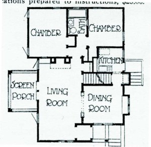
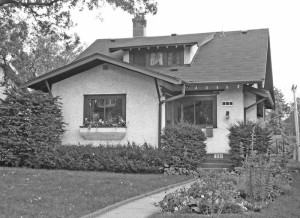
Editor note: In our Fall 2009 newsletter, we printed an article about the 1916 house belonging to club members Randy Rowoldt and Steve Pearthree. It was built using Minneapolis architect J.W. Lindstrom’s house plan, Design No. 330.
Remodeling a bathroom is no small task. What if you have two? Add the challenge of designing bathrooms that fit with the look and feel of the rest of a 1916 bungalow but meet modern needs and even future ones. Then throw in the feeling that the ghost of architect J.W. Lindstorm is watching every move you make to change this house. That was the bathroom challenge facing Steve Pearthree and Randy Rowoldt.
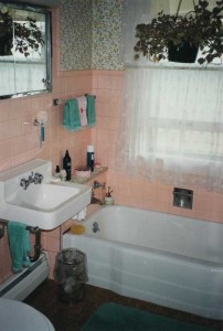
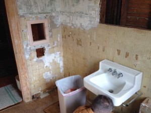
Lindstorm’s floor plan for Design No. 330 included a first floor bathroom, indicating where the sink, tub and toilet should go. While Lindstrom did not provide more details, he certainly would not have prescribed pink plastic wall tile with blue flowered wallpaper on the upper walls and ceiling—a décor from the late 1950s or early ‘60s. “It was rather suffocating when taking a bath,” said owner Pearthree. A 1950s cabinet with glass sliding doors and a row of vanity bulb lights completed the look.
When the house was built in 1916, the second floor was an unfinished expansion space, so Lindstrom’s plan was of no help. The upstairs half bath (no tub or shower) was added in the 1930s. There was a double vanity with knee holes for step stools (designed for children) and flowered wallpaper (again) above formica.
Thinking they would be doing most of the work themselves, Pearthree and Rowoldt started on the half bath first. They tore out plumbing and lighting fixtures, carpeting, the wall formica (finding non-salvageable scored-like-tiles plaster), and five layers of wallpaper (there was a layer of fish amid the flowers). Pearthree also began the task of stripping the radiator.
Planning
Pearthree and Rowoldt did their homework. This included researching their house’s history; getting a complete paper trail of permits for work done previously; reviewing many books on bungalow bathrooms; and attending any and all events that offered bathroom information (including the Bungalow Club’s annual house tour). On several trips to New York, they visited bathroom showrooms for ideas for plumbing fixtures.
During five years of planning, they purchased the upstairs floor tile, light fixtures, a vintage cabinet, hinges and latches for both cabinets, and towel holders and bars.
They began exploring contractors ranging from big box stores to design/ build companies. They stumbled across educational classes offered by Castle Building & Remodeling and after attending the company’s session on bathrooms, they liked what they heard and liked examples of the work—and there was no hard sales push.
Execution
They began working with Castle to do a “makeover” on the upstairs bathroom. Surprisingly, the estimate was half of what they had gotten from Home Depot.
The project timeline was October through December 2012. The experience with Castle was a good one, and after some time to rebuild their resources, the men hired Castle to work on the first floor bathroom, completed in December 2013.
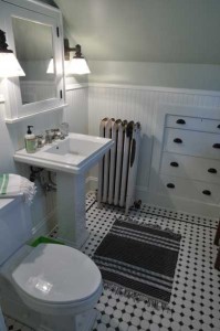
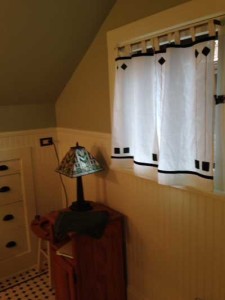
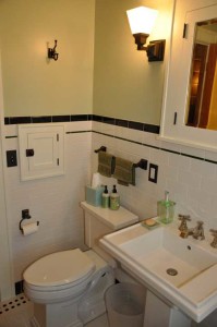
The important goal of creating bathrooms that fit the look of the house was met. The upstairs bathroom is still a half bath, retaining its original radiator and built-in storage unit. The tiled floor has the appearance of a rug, with its off-white field tile accented with green and black in a diamond pattern. Off-white wainscoting and a soft green paint color finish off the walls and ceiling. New sink, toilet, and light fixtures plus a painted built-in medicine cabinet and painted woodwork complete the look. As a finishing touch, Rowoldt designed and stitched a vintage-looking curtain for the window.
The first floor bathroom retained Lindstrom’s original floor plan but the built-in tub was replaced with an acrylic clawfoot (to better retain heat during a soaking bath). To solve the inadequate heating problem in the room, an in-floor heating system was installed. The modern looking thermostat is out of sight behind the room door. The walls were beefed up to handle future grab bars that may be needed for aging bodies.
Pearthree and Rowoldt liked the sink and toilet style they had chosen for the upstairs half-bath so much that they repeated it downstairs. Woodwork is again painted, and, as in the case of the laundry chute opening, replaced to match the original woodwork style. An added bonus: After stripping many layers of paint, the room’s door now closes properly.
They wanted to retain the window’s weight system but change the ropes to chain, so Rowoldt figured out how to take the window apart and put it back together. The window now opens smoothly. And because the window is over the tub, tempered safety glass was installed in the frame with the help of the neighborhood hardware store.
The colors used are again off-white, black and greens. The wall’s subway tiles are topped off with the historical look of a green 1/2″ x 6″ accent liner plus a black mud cap. The floor tiles are 1-inch off-white hexagons with a two-row border of black hexagons.
Assessment
The hiring of a contractor proved to be a good idea but Pearthree and Rowoldt still did a lot of work on both bathrooms. “It’s those areas that it didn’t really make sense for us to pay someone else to do,” said Rowoldt. Those areas included:
- researching possibilities for each element,
- providing references for what they wanted,
- doing as much of the tear-out as they could—except the existing bathtub,
- locating and purchasing many of the new fixtures (plumbing and lighting); for the sinks, toilets and tub, they found the styles and brand names,
- and stripping the paint and wall finishes as well as doing the final painting.
“The contractor’s workmanship was of good quality, and more important, the new elements didn’t dwarf the existing ones. It can be painfully obvious what parts are new and what parts are vintage in many renovations because there is an ‘incongruity’ of scale.” says Rowoldt.
The cost of the upstairs bathroom was about $10,000, and the first floor bathroom was about twice that. None of the estimates they got from other companies were that low for what they wanted.
And because of their research, the men had very clear ideas of what they wanted. The contractor’s designers mostly helped by locating the parts they could not and to draw up the final plans for each bathroom. “I would warn anyone away from dealing with any contractor that does not require a written and drafted plan on any project—you will never know what you will be getting. If you know what you want, you have to be picky, even pushy,” said Rowoldt. Pearthree added, “I thought we were too pushy, but in the end, the contractor thought we were easier to deal with because we knew what we wanted.”
Project Binder
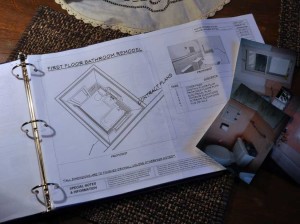 A key tool in keeping the projects on time plus maintaining good communication was a project binder put together by Castle for each room. Pearthree and Rowoldt found the binder extremely helpful. It included things like:
- a schedule for each project (down to the DAY!)
- contact information
- a ‘daily’ pad to list concerns for the workmen
- workmen’s work hours
- invoices and contracts needed for the projects
- receipts for parts already paid for
- floor plans and elevations for the projects
- detailed specifications for fixture placement
- style and make for every element of the project
- building performance guidelines for the work being done including product installation
- mechanic’s and installer’s liens
- resource list about product care and maintenance for each element being installed
- a standard and upgraded warranty
Resource
Castle Building & Remodeling
Design Selection Studio and Headquarters
2600 Johnson St. NE, Minneapolis
(additional design studios in Minneapolis and St. Paul)
612-789-8509
www.castlebri.com


