Small Home Gazette, Winter 2013
Letter From the Editor: going too far with house changes

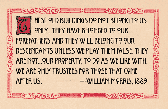
Today we get our architecture fixes from shows on HGTV. Watch a few and you will see a new house philosophy. We don’t owe our houses anything. They owe us.
“Those cupboards have got to go, plus the fixtures. In fact, the whole place needs to be gutted and opened up. This just isn’t me.”
—Bill Morris, age 28 and exasperated, 2013
Far from believing our buildings and homes have a separate existence from ours, we expect them to somehow mirror our personalities—and make us extra sparkly. From the moment we walk in the door, it isn’t about the architecture. It doesn’t matter if it is a 1953 rambler, or a 1919 Craftsman, or a 2005 McMansion. It is about who we are—at this very second.
Like Bill, we are hip in 2013. Of course! We know that teak-colored cabinets and ebonized floors indicate pure sophistication, and that commercial quality stainless stoves are timeless. Past homeowners had disgusting ideas. They made things too small. They used icky colors.
“Like, why is the bedroom Kermit-frog green? Who put yellow tile in the bath? Why is this house all up in my face?”
Bill, please. Just chill.
The house isn’t actually about you. You didn’t design it; you didn’t build it. You don’t know what plaster is. You are considering becoming its caretaker, and if the average holds, you’ll be at that job for just seven years. Then someone new will buy it. Then it will be all about them. And I hate to say it, but they are not going to think 2013 was the acme of style.
When you walk through a house with your Realtor (how many have you seen now, 50?), note when the house was built and what the style is. Tudor? Rambler? Split level? What materials were used? What was playing on the Victrola, or hi-fi, or boom box? If this house could talk, what would it say? Can you shut up long enough to listen?
Bill, let’s look at the year you were born: 1985. Google 1985 home interiors. There was a lot of white with black accents, or white with white accents, or white with red accents. In the kitchen, white with tan accents was haute. There were those ubiquitous Nagel prints. The top song was by REO Speedwagon. This is the real you.
The you that wants to remove every wall in the house to “open it up” so you can more easily imagine your friends sitting there enjoying your house-carbonated mojitos cocktails while you whip up something amazing in the kitchen. That is what you imagine is important in 2013 and what you imagine yourself to be.
It will be so over in 2015.


